The Beat
I was brought on to design and develop a campaign for a headphone company, sadly the project did not see the light of day as it was scrapped at the last second. The concept was develop three distinct yet harmonious sections showcasing the product in a multifaceted way. The consensus was to bring in a VHS feeling for overall mood and to create tangibility. Below is a breakdown of the sections Frame, Sharp and Color below. All design and animation was done in After Effects with some light Photoshop work for any hand drawn assets. Most of the time when I’m expecting to work in After Effects at all - I tend to go and directly design in there.

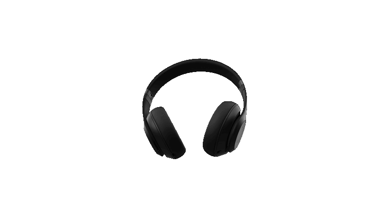
Some outside problem solving here that I’m proud of- I didn’t have access to a 3D artist to make any assets for myself. I went to the product page, took screenshots and cleaned them up into png sequences. :)
FRAME
To kickoff the piece the first section was dubbed Frame, we showcase the product in a turn around moment. As we see on each turn a different genre of music as portrayed by the photographs on each frame. The most tangible one of the sequence we wanted to show grit, texture and a human hand drawn feel. While the shortest it was the most involved overall. For a hair of extra charm we ended the section on a “change the channel” frame with a subliminal message embedded.
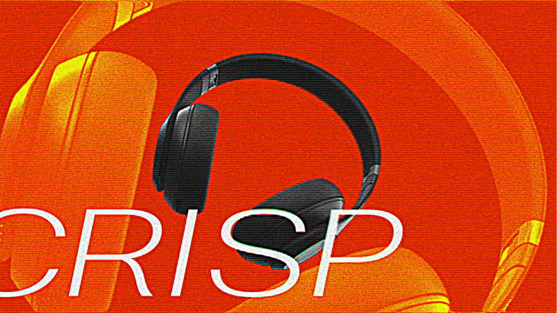
SHARP
The 2nd section called Sharp was focused more heavily on a cleaner layout, strong typeface with a limited complimentary palette. The aim was to exude an edginess that was still professional - bold cuts, quick actions and smooth movements were our friend. The typography and type animations helped to add to the “sharpness” (hehe) of this sequence.
ALTERNATIVE DESIGNS
COLOR
The last and final section of the sequence titled Color (for obvious reasons). A quick short to something more simple and more minimalist, to contrast with the black base product, we wanted to show case the full range of colors offered. It became a play on utilizing the rainbow essentially but without being to garish or repetitive, while its the simplest section it was the last and most challenging. All three needed to work together sequentially and that’s not always as simple as it appears.